Friday, May 7, 2010

Apples and Oranges: a Review of Marvel U's Extremis Iron Man figure

Now i'm sure some of you are familiar with the Marvel Universe toyline by Hasbro, which deals with 3.75 inch tall figures of your favorite Marvel characters. you may also know Hasbro created template bodies for multiple characters for ease of production, like making Daredevil and later re-using his body for say... Black Panther or Union Jack (if i made an error on these figs feel free to correct me). of course as the line grows longer  there's more new stuff to come out with unique molds. one such figure is Extremis Armor Iron Man from wave two of the "Hammerfiles" series. and i'm here with comparisons between the first modern iron man figure from the very first wave and the Extremis version. 

let's start with comparisons, first up the basic look of both figures, let's have the modern armor figure go first:

(click for bigger image)

now compare this with the Extremis version:
(click for bigger image)

already the differences are huge between these two figures. the Modern armor version looks rather squarish and the proportions seem a bit strange, it has that blockier more segmented feel, contrast that with the Extremis version whose likes are smoother and favor curves, as well as having a well proportioned sculpt... though the thighs are weirdly thick. 

now then let's compare their ranges of motion by putting them in the iconic Ground Punch pose:

first, the Modern Armor again:


then Extremis:


in my opinion while both figures can smoothly accomplish the pose to some degree, the Extremis version feels more natural, albeit incomplete in some respects. this is particularly due to the articulation being designed in a way that it is incorporated into the design without taking too much away from the figure in terms of look. and boy does it ever look handsome:


this mold is so full of detail and the sculpt is the closest to ever get to the original Extremis Designs of Adi Granov. if not that it's pretty close to the image of the armor as drawn by Carlo Pagulayan in Iron Manual. now i've said before the articulation of this is smoothly integrated into the mold, well this is the first ever iron man from hasbro with the ability to fully look up:
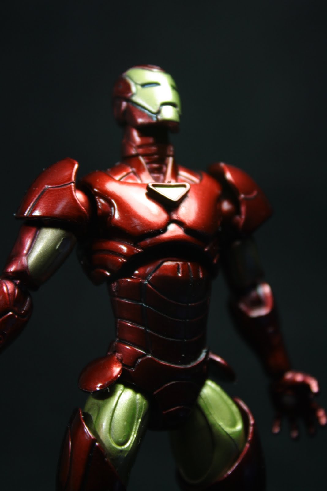


i tell you what, this makes flight poses a hell of a lot more convincing in my book. aside from the shoulder pads being assembled in reverse in all of the toys (i like them the way they look in the comics) this thing also sports the best color palette and application of any Hasbro iron man toy to date! (YES you read that right--
 a GOOD PAINT JOB. FROM HASBRO. ON IRON MAN. i know kinda hard to take in, let it sink into your brain a bit.). there are still some errors here and there, though it doesn't take away too much from the figure. they successfully captured the "real world-y" gloss colors of the Granov design and put it into three dimensions. what else can i say, this thing is beautiful!--from a design translation point of view.

as with all iron men he comes with a wrist-mounted repulsor blast:


and like the newer hammerfiles figures, a stand with his name and number:


the overall rating i'd give this figure, even with my own bias towards Iron Man is a solid 9 out of 10. what i don't like about it is that it's so well done i'm afraid of posing it too hard and scuffing the paint, which is very hard to match when you try to repair minor flaws. you will be left the only option of repainting the entire thing then. another point is that this figure is part of a wave that never reached the philippine stores because MU's are hardly bought off the shelves these days. in fact i had to get mine from singapore via another collector who was kind enough to accommodate me and many others.

 but if you have a chance of getting this guy, don't pass, GO! seriously, he's a must have for any Iron Man fanatic, and he's damn sexy too!


Cheers, 
Miko Tizon/ Eisen 2010


Saturday, April 24, 2010

DAMN.

that is one brutal asskicking...

">


Iron Man 2 Hits Theaters next week, April 30

Thursday, April 22, 2010

Small Scale stuff

you know the Marvel Handful of Heroes pack isn't so bad, save for the disproportionate sculpts they do but i like how detailed they are regardless, it's one of those things that seem like crap at first but once you experiment with it it's alright.

naturally i painted up the line's Iron Man figurine. i was lucky enough to get the modern armor version,


in retrospect this was a good exercise in precision, granted i need more practice, but it felt great doing this,
kinda like painting your own heroclix figures.

Friday, April 16, 2010

Thursday, April 15, 2010

Iron Man: Legacy issue 1 or why won't the Melter just fade into obscurity?

just got Iron Man: Legacy issue 1 today and....


this is my favorite page in the entire comic.
 i mean seriously, i laughed hard at this page, it's so LOLWTF when taken out of context.
that and how many times has the Melter or any of the people using his tech been used in any Iron Man comic (SURPRISE HE'S DEAD) since the last decade? last i heard of him (or somebody using his tech) was in  Matt Fraction and Salvador Larocca's  Invincible Iron Man #4. and wouldn't you know it, he gets his ass kicked (you'll read a lot more about how the persona of the melter is so unfortunate by clicking the link above).  i mean hell, in this first issue of legacy they even refer to the threat level of the guy as low. dude/s can't catch a break.

second thing to talk about: the Armor.
above is the first glimpse we catch of the new design, which appears to be an amalgamation of the movie and extremis designs. i've read that the armor's look will be unique for this series, and it's done for practical purposes to be a reference point for new fans or old fans getting into the new look of shellhead (more on this later) the way Steve Kurth handles it, the lines--particularly the face  looks off to me in some way. i can feel that the movie design is very hard to put into pen and paper for some artists, perhaps it just lacks the rigidity and sharpness of the armor seen in the movies due to it existing in three dimensions (i know transformers has this trouble as well in their movie comics). below is a better, full body look of the design:

i won't say i hate it, but it just feels so strange. parts of it look organic, parts of it mechanical, never quite a cohesive mesh of both. i dunno maybe it'll grow on me as the series moves on


anyway...
 moving on, the issue--or so i've heard the entire series--acts as a stand alone story that helps to ease fans of the movie into the mainstream (earth-616) incarnation of Iron Man by presenting stories inserted within shellhead's colorful history. these stories are intended to be stand-alone tales, meant to combine the aspects of the movie (such as Arc Reactor technology) and those of the comic series (like people assuming Iron Man is Tony's Bodyguard and not Tony himself).  what can be said about this run is that it seems to be spotlighting Tony's inner struggles, between his legacy as the CEO of Stark Industries, like his Father Howard Stark, and growing out of that Death Dealer persona being imposed on him by his/father's Company, and by the start of it he thinks he has... until Rouge Iron Men start going on a murder spree in Transia (where do they get these names?)  located in marvel's fictional Europe. after a few days mulling over the situation he decides to deal with this incident himself repulsors a-blazin, this makes him fall out of favor with the American Government, and due to Transia's ties with Russia and China, he's going to catch the attention of a certain comrade in crimson. yeah i know it smells like Armor Wars, but it's fresh! the mastermind behind all of this?

(spoiler alert! highlight at your own risk!)

Doctor Doom

this arc is aptly named: War of the Iron Men.

Fred Van Lente is at the writer's helm of this yarn, and this is the first time i've been exposed to his work, and i like it enough to stick around. same goes for Steve Kurth, and though i can understand the movie aesthetics can be a bit hard to translate into 2D especially in Kurth's style, as mentioned above the look of the armor in some places just seems... wonky to me.

personally i love where this is going because it is starting out to be a story of Tony Stark, fighting things he supposedly created-- the weapon to end all weapons, but  it's not him against his own tech like it often is in these kinds of tales, but rather him fighting against an aspect of his identity. that of being a maker of weapons that kill people, being used in the most horrific of ways (ethnic cleansing for example) his image is crushed--yet again--and it's up to him and him alone to make or build his way out of it. will he come out of it a hero, or as an international war criminal? follow the comic to find out.


it's on sale now!

PS: this comic also includes a re-print of Iron Man's First ever appearance in comics, and his old, cold-war origin story from Tales of Suspense # 39 digitally recolored. it's really cool how the old art looks so...shiny.

Tuesday, April 13, 2010

Love Me Nice is niiiice!

i recently came across a very cool webcomic:


Love Me Nice is a comic by the talented (i checked her portfolio, and it's all sweet work) Amanda LaFrenais, that deals with the relationship of 'toon star Mac Jr. and his Manager/Girlfriend Claire. Mac lives the life of a superstar toon, following in the footsteps of his father, Mac. Sr, while trying to keep his relationship afloat with Claire who--despite Mac not feeling it--works very hard to take care of his image. recently she's also become the manager of Mac's Co-star, Carolina, who had a crush on Mac (for advantageous reasons...and got a boob job because of him), and is now acting as a "life coach" to her.

the plot is just unraveling and it's very recent, going online October of last year, but i can tell a lot of planning went into this wonderful read, the art is really fresh and detailed, and it has that feel of cartoon sexiness i can compare to Rockin' Jellybean or old sexy comic pinups, which is a style i can really dig. it' cute, and quirky but has a good amount of dramatic tension between characters, and is a rather welcome tale about showbiz and reaching your dreams. but of course at the very heart of it is two toons in love, and like the comic's premise goes, people do a lot of crazy things when they're in love

you can check it all out here:
http://www.lovemenicecomic.com/

i know i'm hooked!

Monday, April 12, 2010